
How to Read Your Shopify Analytics Like a Designer
Most founders check their analytics looking for marketing answers: did the ad work, did the email convert, is traffic up or down. Understanding your dashboard and where/how to read your Shopify analytics can help in more ways than one. Fewer realize that the same dashboard is full of design clues — signs that something in your storefront’s layout, flow, or experience is quietly costing you sales. Here’s how to spot them.
Bounce Rate Tells You About First Impressions
A high bounce rate on a specific landing page usually isn’t a traffic problem — it’s a first-impression problem. If people are leaving within seconds, the page didn’t deliver on what they expected when they clicked. Check whether your headline and hero image actually match the ad or link that sent them there. A mismatch between promise and page is one of the most common (and most fixable) design issues.
Time on Page Can Mean Two Very Different Things
Long time-on-page sounds like a good sign, but context matters. On a blog post, it usually means genuine engagement. On a product page, it can sometimes mean confusion — a shopper who can’t find the information they need (sizing, shipping cost, materials) and is scrolling around searching for it. Pair time-on-page with your conversion rate for that page to know which story you’re actually looking at.
Exit Pages Show You Where Trust Breaks Down
Shopify’s behavior reports show you which pages customers leave from most often. If a large share of exits happen on your shipping or returns policy page, that’s not a coincidence — it usually means something in your policy language (or its accessibility) is creating hesitation right before purchase. This is a design and copy fix, not a marketing one.
Device Breakdown Reveals Layout Problems You Can’t See Yourself
If your conversion rate is notably lower on mobile than desktop, that gap is almost always a layout issue, not a customer-quality issue — the same people, just hitting more friction on a smaller screen. Pull up your own site on your phone with fresh eyes and walk through a real purchase. Slow-loading images, cramped tap targets, and hidden navigation are the usual suspects. I always recommend designing for mobile users first as a higher percentange of customers are shopping on their mobile vs. desktop or other device.
Funnel Reports Show You Exactly Where Design Is Losing You Money
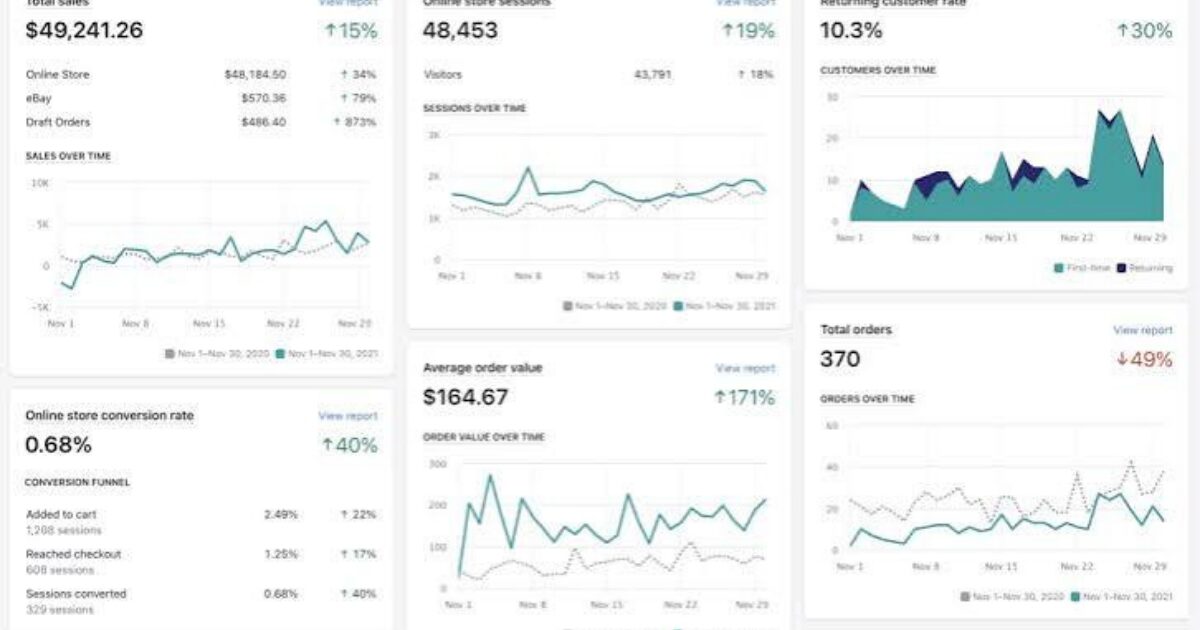
Shopify’s checkout funnel report breaks down every step from cart to completed purchase, showing the percentage drop-off at each stage. A steep drop between “shipping info” and “payment info,” for example, often points to unexpected costs or a confusing form — both design-adjacent problems, not just checkout bugs.
Analytics aren’t only a marketing tool — they’re a diagnostic tool for your design. Learning to read them with that lens means you’re not just asking “is this working,” you’re asking “why,” and that second question is usually where the real fix lives.


comments
posted in: